
Time Log
- Sunghyun Ahn (2026-03-15, 14:58-15:23)
- Christopher Yang (2026-03-15, 15:25-15:53)
- Doga Karabey (2026-03-15, 15:55-16:30)
- Fariha Shah (2026-03-15, 18:05-18:35)
- Evergreen Explorer (2026-03-15, 18:37-19:06)
- Seattle Beyond the Guidebooks (2026-03-15, 19:07-19:24)
- The Local Cut (2026-03-15, 19:27-19:41)
1. Summarize your activities, including new content created. Provide all the hyperlinks of new content.
In this assignment, I created two new posts. The first post talks about the Japanese island of Aogashima and its unique that its inhabitants occupy. The second post covers the 10,000-year-old forest Pando that is actually a single tree. In addition to the new posts/pages, I also updated the homework directory page and website directory to include links to the new content.
2. Summarize your KPI Table. Include a screenshot.
| Goal | KPIs | Metrics |
| Maintain and Grow User Base | Total Active Users, New Users | Scorecard for total active users and new users within current month Time series plot of these KPIs over the course of the month |
| Monitor and Improve User Engagement | Total Views per Active User, Views per Session | Scorecard for total views per active user and views per session within the current month Time series plot of these KPIs over the course of the month |
My KPI table is interested in two things: the website’s user base, and their engagement in its content. For the first, I track both total active users as well as the number of new users. Total active users gives us a sense of how the website is doing, but new users gives us some insight into where it’s going. Second, I track total views per active user and views per session. The idea of both is to get a sense of how “deep” or “shallow” user visits are. For example, does a user skim a single post and then leave (shallow), or do they view multiple posts (deep).
3. Summarize your Looker Studio Report with your identified KPIs. Include a screenshot.
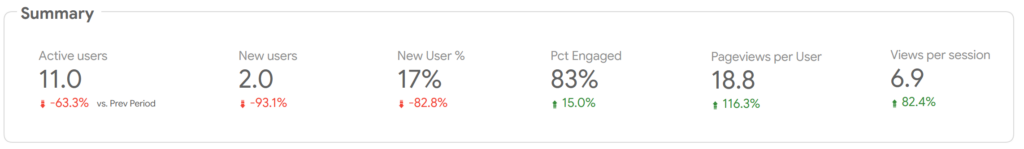
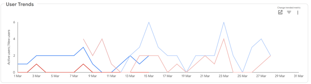
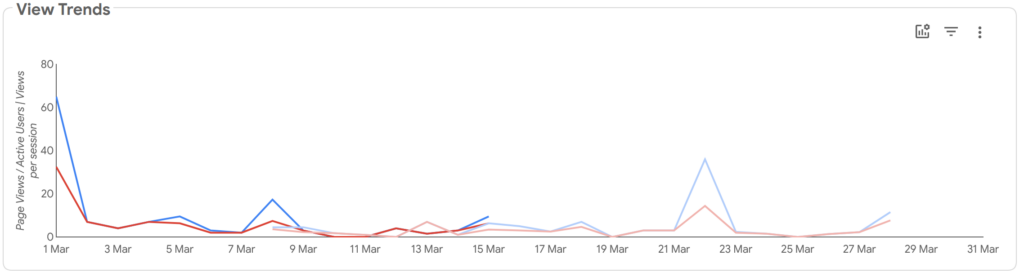
The dashboard can be understood in two parts. First we have the scorecard that show an aggregate of the KPIs over the current month. Second, we have time series plots for the user and view trends over the current month, with reference lines for last month. Based on these metrics, we see that the user KPIs have done worse this month compared to last month, but that the view KPIs have done better. Since the view KPIs are normalized to per user/session, the conclusion would be that we overall have fewer users, but the users that are visiting the website are visiting more of the site. For example, perhaps we’ve retained the core user base but lost the newer one. The response would be to investigate how to attract and maintain new users without losing the old users (e.g., content of more varied subjects while still providing the old content).
Leave a Reply